This spring, Community is introducing an updated logo with the launch of our new website on Tuesday, April 15, 2025. Following the launch of the new website, the bank will also update the logo on our other digital products, including our online banking site, mobile app, and social media accounts. Community will update our logo on our various print products in the coming year.
Community has used its original logo for over 40 years, since the bank’s second president, Harvey Cleven, introduced it in 1976. This version of the logo features four intersecting circles, with each circle representing a different aspect of Community’s “Total Service” offering:
- Blue represents telephone banking;
- Green represents checks;
- Pink represents checking cards; and
- Yellow represents the “Total Service” offering to our customers and the community.
These circles were important in articulating the bank’s mission in 1976: At a time when many banks were building branches, Harvey envisioned a cashless world where banking was possible anywhere, at any time. Instead of going into a physical branch, Harvey was inventive in his product offering. Community was one of the first thrifts to offer NOW checking accounts, telephone banking, and ATM cards to its customers.
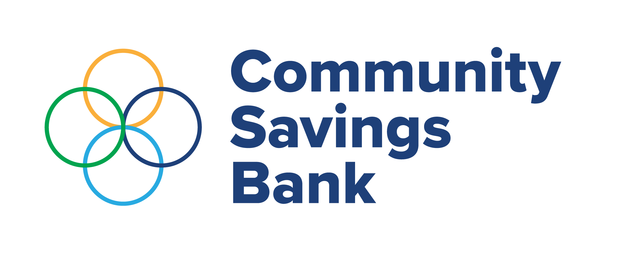
Since then, Community has used a version of this logo with the words “TOTAL SERVICE” featured, accompanied by our name, Community Savings Bank. Some versions of our logo also include our tagline, “Your Personal Neighborhood Bank.”
![]()
The original logo was designed for optimal viewing in print mediums. For example, the original logo features the main colors of the color-printing wheel: Cyan, magenta, yellow, and key (black). This logo was designed to stand out in print mediums such as brochures, signs, and newspaper advertisements.
As the world has changed, logos have too. Today, designers create logos optimized for screens. As screens have shrunk from large computers and televisions to handheld phones, logos have become simpler with less text. To make the new version of our logo optimal for viewing on smaller screens, we will be removing the words, “TOTAL SERVICE,” out of the top circle of our logo.
The new colors in the updated logo also represent Community’s values:
- Light blue represents, “Trustworthy;”
- Green represents, “Reliable;”
- Yellow represents, “Opportunity;” and
- Dark blue represents, “Loyalty.”
We hope this updated logo maintains the integrity of the original logo designed by Harvey Cleven, while giving it a more modern look-and-feel. Though the new logo may be an adjustment, we are excited to make this change and hope to attract some younger customers with its use on the new website.